Premium users will have an additional chart plotted directly below the main price graph - this is to show the trade volume of an item without the need for scrolling down. The benefit to having the graph directly below allows you to see the change in trade volume as it is directly related to the price of an item.
Bar Colours
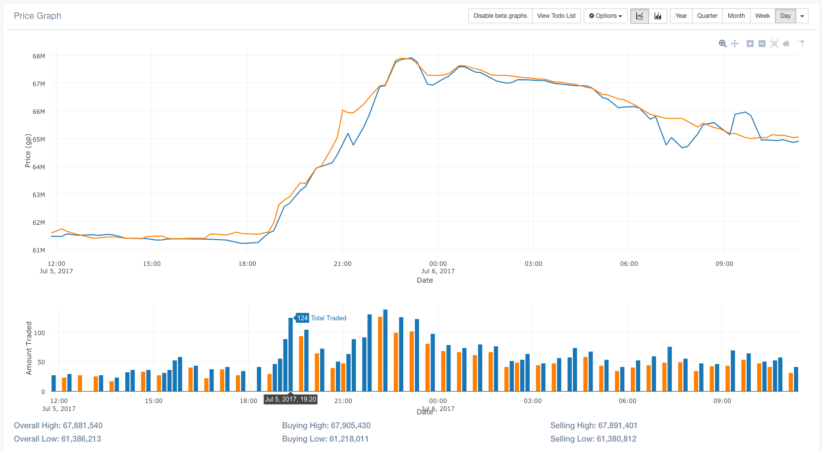
The colour of the bars is largely the same between the two [single + split] modes, however the logic differs slightly for split bars as you are looking at a finer grain of detail.
-
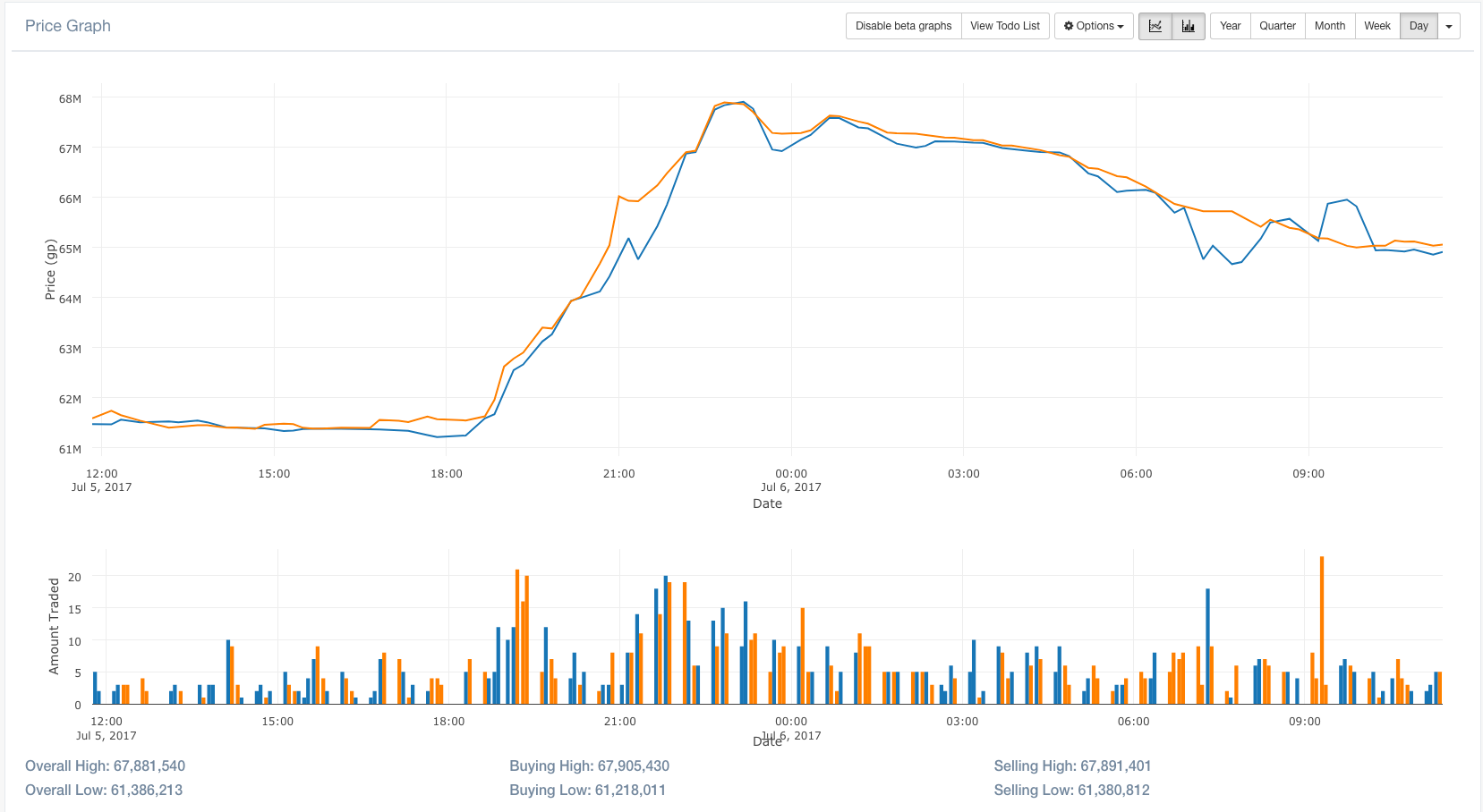
Total Volume (single bars)
- Blue = increase in demand
- Orange = decrease in demand
-
Buy Volume + Sell Volume (split bars)
- Blue (buy) = increase in buyers
- Orange (buy) = decrease in buyers
- Blue (sell) = decrease in sellers
- Orange (sell) = increase in sellers
The highlighting of sell volume is the inverse of the buyers as this means that more merchants are dumping their items, and could greatly affect the price of the item.
Example
In the example below, we will look at Dragon Warhammer and when the announcement was first made to remove the safe-spottable Shamans.
When the update was posted, it was clear that the amount of DWHs entering the game would decline, thus increasing both demand and price. This can be seen in the total volume (single bars) graph below:
The volume stayed at a consistent level until the announcement was posted. Directly after, a sharp increase in trade volume can be observed, consistent with a spike in the item price, which leads to the bars being highlighted blue.
The following graph is identical to the graph above, with the exception of the split bars mode being enabled. This allows the split between the buyers/sellers in more detail.